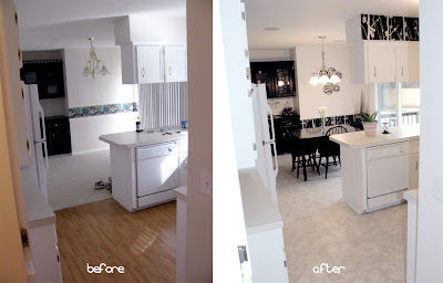
Without further ado... the first installment of our home improvement project!
I really wish we had a mud room or at least a little more space in our entryway, but this is what we have to work with. For organization, I purchased one of those cloth wall hanging pockets for the inside of the coat closet and this cork/white board for our lil family command center.
Major changes in the kitchen/dining room area include:
- Solid vinyl tile flooring
- Repainted all the walls and ceiling
- Added wallpaper below the chair rail and soffits
- Two new light fixtures
- Painted the hutch black (from it's original green)
- Refinished the dining room table and chairs
- Removed all the tiny dowels from the top of the cupboards
- Added valances over both windows
- New silver doorknobs, handles and hinges
- Four sets of speakers installed in the ceiling throughout the house
Can't find a curtain rod that will fix a space the way you want it? A couple of tension rods work great! A huge thank you to my mom for making my valances!
When we purchased our home, there was the ugly, plastic strip underneath our cabinets. With our new floor, my husband made these really nice looking kickplates with the leftover vinyl tiles!
Pier 1 had these handy lil wine glass holders that fit nicely underneath the upper portion of the hutch.
After we knocked out the old people dowels above our cabinets, we inlayed some white Christmas lights down in the groove. Fortunately, there was already an outlet in one of the upper cupboards... so all it took was a small hole to feet the plug through.


The house looks great. You guys have done a lot so far. I love the white and black theme. -Sarah S -
ReplyDeleteLooks great love the color choice and the pattern in the wall border!
ReplyDeleteLooks really cute! Great job! Love the light idea and the tension rod idea!
ReplyDeleteJulie
redheadcandecorate.com
love the tree wallpaper-neat! what a big difference in those rooms.
ReplyDeleteDo you mind sharing which brand and color of vinyl tiles you used?
ReplyDeletefabulous makeover
ReplyDeleteThanks Carissa!
DeleteThis looks fantastic. I love the black and white. I am hosting a link party and would love it if you would link up. http://ifitsnotbaroquedesignblog.blogspot.com/
ReplyDeleteThanks Lauren! Love your blog... all linked up! :)
DeleteI am featuring your kitchen/dining room today on my blog. Thanks for linking it up. It looks great. This week's party starts later today, I hope that you will link up again. Thanks.
ReplyDeletehttp://www.ifitsnotbaroquedesignblog.blogspot.com/
Tension rod idea is great, and love those wine glass holders!
ReplyDeleteREally amazing change to that kitchen! SO much better in the after photo, well done! Stopping by from Homework Creative Party. :) http://www.cmongetcrafty.com.
ReplyDeleteThanks Megan!
DeleteLooks amazing! I love the pop of green.
ReplyDeleteI found your website from Southern Lovely. I just started a new blog and I would love for you to follow me, too! http://naptimenothings.blogspot.com/
Looking forward to more posts!
Sarah@
Naptime Nothings